
DESIGN PROCESS: Evolution of a Business Card
Just made new business cards. Really happy with the results, but it took a lot of experimentation and prototyping to come to the final design.
Read more below the fold if you are interested in learning more about my design iteration process…
Evolution of a Business Card:
Recently decided it was time to refresh my business card and I wanted to create something special. I could have just used Vista print, but I wanted to make something more creative that reflected my work. I tend to give out only a few hundred cards a year so I also wanted to look into something that was hand crafted to represent the custom work I do professionally.
Last summer I visited an old friend of mine, Michael Green, at his studio in Rhode Island. Mike is a large scale sculptor who primarily works in metal and ceramics, but he has also experimented with building some interesting light sculptures using small rectangular fresnel lenses patched together around LED lights to create distorted columns of light and refraction.

Mike had several thousand extra fresnel lenses left over from the project. He offered them to me and grabbed a stack to play with. I’m always playing with light so I figured I’d find something to do with them.

These lenses are normally sold as portable magnifiers for reading small text or if you have poor eyesight. The lenses are the same size as standard business cards since they are designed to fit in your wallet.


They sat in a drawer for several months before I was ready to start experimenting. In August I decided to start playing with designs. It took several iterations (and failures) before I came to something that met all my design requirements:
- Unique/Memorable
- Plays with light (my favorite thing in the universe)
- Combination of visual and tactile patterns
- Minimal text qty/size/area but still readable
- Rapid and repeatable production quality
- Under $.50 cost per card
CLASSIC “BRANDING”
My first idea was to see if I could actually melt my information into the surface of the plastic with a branding iron. The idea of actually “branding” my cards felt too clever to not try. I also really liked the idea of contrasting of the rough melted edges of the type with the precision lines of the optical lens and hoped it would provide both a visual and tactile experience.

My first prototype was created by heating up the tip of a sharp flathead screwdriver and pressing it into the card to spell out my name. This actually resulted in a satisfying test of what it would be like to have melted lettering.

The letters had a satisfying tactile feel to them. As you dragged your fingers over the surface the transition between the rough edges of the lettering and the smooth ridges of the plastic lens surface was exactly what I was hoping for.
But even though I had achieved a satisfactory tactile experience, this hand lettered technique would be too slow and inconsistent to produce several hundred cards. This encouraged me to pursue the “branding” concept further. I just needed something more practical for production, like a stamp…
Fortunately I just happened to have an old linotype metal stamp of my name my parents got me when I was a kid. I used some pliers to hold the stamp over the open flame of my stove and got it nice and hot. I tried pressing the heated stamp into one of the lenses… no luck. I wasn’t able to get a legible impression. 🙁
I looked into custom branding irons made. Found a bunch of options for electric branding stamps on Esty, but before I laid down $60-120 get a custom stamp/iron I wanted to do some testing to see if this kind of “stamp on a soldering iron” solution would produce the results I was looking for.
In addition to making sure it would be able to melt into the plastic, I wanted to see how small my type could get with this somewhat imprecise melting technique. I wanted to maintain most of the card as “negative space” so you would still be able to use the fresnel lens.
Found a friend who had made a custom branding iron with their company’s logo and he lent it to me to do some testing.
This time, the iron was hot enough to melt into the plastic, but as I feared might be the case, the results were less than precise.


It was clear from these tests that there was no way I was going to be able to produce a card with legible text and even if I could, it would be really difficult to get any sort of consistent results.

Reluctantly, I gave up on my “branding” technique. 🙁
STAMP IT OUT?
I still wanted to see if I could achieve a raised texture effect for the printing so the next option I looked into was embossing stamps. I was thinking that maybe I could get a effect like the old raised letter label makers.

The next day I happened to be driving around running some errands and I noticed Berkeley Stamp & Engraving Co. on University. I decided to stop in to see if they could offer some expertise. I showed the guy at the store one of the lenses and he quickly nixed the idea of embossing the plastic, too thick and too brittle.
I asked him for suggestions on alternative approaches and he showed me some waterproof alcohol based inks that worked well with plastic. He let me run a few tests with the ink with some demo stamps they had out and the ink seemed to stick well. Because the lenses are non-porous the ink couldn’t absorb into the surface and was applying unevenly. The text was legible and even had a cool “distressed” look that I thought might offer an organic contrast to the more industrial plastic cardsl. I bought a few ounces of the ink to take home and run some more tests.

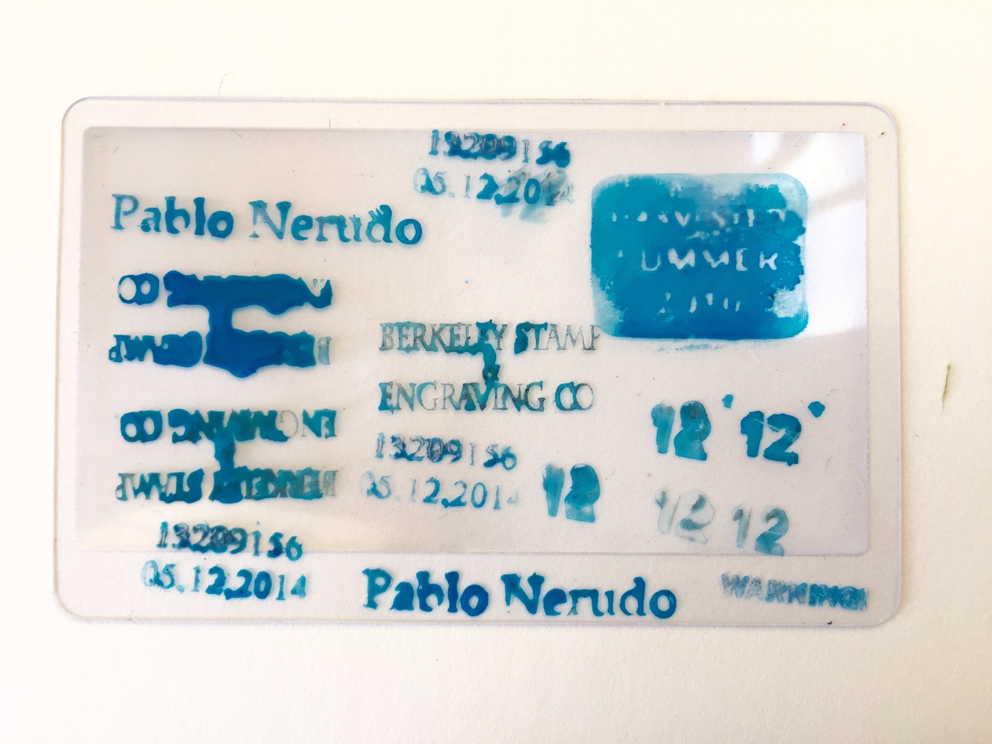
Looking online I discovered I could order self-inking rubber stamps from Vista Print. With a 40% off sale the stamps only cost me $10 each so I decided to splurge and get them sent 2 day shipping. I wasn’t sure if they would work but I figured it was worth the expense to run some tests and if they worked the self-inking mechanisms could help me automate the stamping and allow me to build a rig to hold the stamp and cards to assist in precise positioning.

The stamps arrived in just 2 days and I was eager to run some tests. I had to wash out the water based inks of the self-inking pad and let the pads dry out. I then applied my alcohol based inks to the internal pad.

I stamped out a few cards and let them dry. The results we somewhat disappointing. Not only was the stamped text hard to read, but the ink prints also were very inconsistent. The alcohol based inks are much less viscous than water based inks and didn’t cling to the rubber stamps as well. Printing on a hard non-porous surface like plastic also was less forgiving than a paper and the inks easily pooled up and streaked.
Stamping was seeming like a dead end. I needed to try another avenue…
FRIGGIN’ LASERS
One option I had been thinking about was laser etching. I thought that this would not only be futuristically cool, but I’d likely be able to get really precision detailing and could play with not only text, but also additional design elements. This seemed promising and I was excited to explore.


Some friends had recently purchased a laser cutter/etcher. I dropped by their shop to talk about etching my info into the cards. Their own cards were laser etched wood laminate so they were thought it might work and said the cost might be within my budget.

Pretty quickly we realized that the plastic lenses are made of PVC which is a prohibited material for laser cutters. Not only would the laser release toxic chlorine gas, but the fumes are known to gunk up motors. It was not only hazardous, but could potentially damage their machine and void it’s warranty.
No go on the laser cutter 🙁
I talked to another fabricator at the shop and about the option of using a CNC milling machine to etch into the cards, but that option was going to be cost prohibitive for producing hundreds of cards.

At this point I was feeling kind of discouraged and was even considering abandoning the idea of using the fresnel lenses since they were proving to be so difficult to work with.
After a few moments of doubt I decided I wasn’t defeated yet. I really loved the fresnel lenses, they were really unique, and I particularly liked the idea of helping to save them from the trash bin and giving them a new life.
Thinking through all the problems I had come up with so far in my prototyping I realized that the main challenge to getting my information onto the cards was that it was just really difficult to print onto plastic. Inks didn’t work well and etching was turning out to be dangerous or expensive. I needed to explore new options for printing onto plastic.
I found several companies online who specialize in printing on plastic. Custom printing onto my lenses was possible, but it was going to be too expensive at over a $1 a card (with a minimum order of 1,000). I could abandon my own plastic lenses and get new plastic cards printed for around $.40 each but using new clear plastic seemed not only not cool, but wasteful. All of these solutions would also force me to pick a final layout/sizing for the text with little or no opportunity for iterating before finding an optimal design.
I then remembered my brother-in-law (who runs a printing company) told me that he had an ID card printer for making badges and ID cards. This seemed like an exciting possibility. Not only would I be able to print in full color, but I could print single/small batches while I iterated and refined the layout (not to mention get the “family discount”).

I spoke to my brother-in-law and he let me know he was actually about to sell the printer, but that if I wanted I could use it for my project before he sold it. Before having him send me the machine from the east coast I sent him a few lenses to try out in the ID printer.
While the sizing was perfect for the machine, the tests were pretty much disasters. The printers are designed to work specific ID card blanks and the fresnel lenses, while they fit perfectly in the printer, turned out to be too thin and melted in the machine. Fortunately my brother-in-law was able to get them out of his machine (unfortunately he threw the melted cards away before I could ask him to take photos. Darn!)
I decided to rethink my approach. As much as I had wanted to brand, etch, emboss into the plastic surface I realized that I needed to consider an alternate approach to getting my information onto the card.
Looking into industrial printing options had got me thinking about all types of printing, thermal transfer, inkjet, silkscreening, and laser printing.
The idea came to me that perhaps I should explore not printing directly onto the plastic lense, but creating a sticker that could be attached to the lens. Even if this wasn’t going to be a technique I would use in the final production process it would be useful to be able to easily play with the graphic design of the text sizing/fonts/layout, especially if I was going to have to commit to a layout before sending it to an industrial printer for batch printing.
I quickly found some clear laser printable labels from Avery and ordered online. They arrived the next day and I began playing with some text layouts as well as some options for background patterns.

I was initially concerned that using clear labels on my cards would appear obvious and “cheap” but I was really pleasantly surprised with how great the labels looked on the lenses. The small mailing labels I ordered fit perfectly inside the lens area of the card. In addition, the somewhat frosted “clear” labels actually ended up looking like a sandblasted surface rather than a cheap label.
I also was happy to realize that adding the small label to the middle of the lens gave that area a raised surface that made the card more texturally interesting. It felt great to run your fingers over the surface and then feel the smooth raised label on one side and the textured ridges of the fresnel lens on the other side.
A fun trick I discovered was to print the text in reverse and apply the labels to the back side of the lens and let the text be viewed through the plastic. This gave the impression of the type being embedded inside the plastic of the card itself, a cool effect that isn’t easy to figure out how it’s achieved. (I love a little mystery!)
After all my failed attempts I had finally come to a design that not only was easy/inexpensive to fabricate myself, but succeeded in developing a layered assembly that provided an interesting tactile and visual experience that I’m pretty sure is one of a kind. BOOM! 🙂
GRAPHIC DESIGN/REFINEMENT
Now that I had figured out my physical design for the card I moved on the visual design of the label.
I played with several background patterns behind the text to add some more complexity to the visual impact. Since the plastic is mostly clear I wanted to give the informational window a little more weight and substance than just floating text.


I settled on a simple interference pattern graphic that I felt worked in several ways: 1) it’s a visual expression of the optical fresnel pattern that you can feel with your touch, 2) the visual diagram of the beautiful complexity that can emerge from the intersection of simple patterns seems like a fantastic metaphor for the collaborative work I love to do and the graceful results I seek to achieve, 3) on a more subtle/personal level I also resonate with the Venn Diagram reference since I’ve recently fallen in love with this mapping of the artist’s life:


FINAL REVISIONS/USER TESTING:
After settling on a physical design and my background graphic my last step was to finalize the type and information design. I wanted to try and go as minimal as possible with text to keep the information from becoming too busy. I also wanted the card itself to me more graphical and tactile than informational.
But of course, this is a “business card” and the ultimate function of it is to make sure folks can get in touch with me.
With that in mind my first draft of the type layout was as minimal as I thought I could get away with, just my name and my phone #. While I know we now live in a world of email the thinking behind this version was that my name is unique enough that if someone is on a computer and wanted to get in touch with me they could google my name and my website is the top hit.
I know, kind of annoying to make folks search me and, worse yet, had the potential of coming off pretentious, not the impression I wanted to make. But it did make for a very clean and minimal design.
I also included the USA “+1” international code at the front of my phone number to give it a less pedestrian and more interesting look (plus I do travel/work internationally). I liked how it gave it a more retro look and made the number appear more as a special code then a boring old phone number.
I knew this initial design would probably not be sufficient, but I decided to print up several dozen of this version and hand a few out to see reactions and how it felt to me. Sometimes I think it’s important to test out an idea you think might have gone too far. It may not actually be as far out as you think when it’s in actual use and, at very least, you may discover new options than you were initially considering.
I handed out a bunch of cards, both to friends as well as professional contacts. In general I got very positive responses from people. I felt proud of the design and how it represents my interests and approach to my work and it felt good to give it to folks.
After several weeks of testing I began to accept that the card needed more information. Not only did it not have any of my online info, it also didn’t clearly state what it is I do. I don’t want folks to walk away thinking of me as just some guy who has a unusual busniess card.
So I revised the text to include my website as well as listing out my 3 areas of service: DESIGN, PRODUCTION, and STRATEGY.

It was challenging to fit all that text in a small area without it looking like a busy mess and dominating the clean composition I wanted to maintain. I also struggled to make sure the background rings didn’t interfere with the legibility of the letters. After a long exploration of adjusting type size and position I also added a subtle white outline to all the letters which allowed me to keep the background bold enough that it was visible, while also letting each letter stand out.
I’ve printed out several dozen of these “final” designs and handed them out and it feels like I’ve arrived at a card I’m really happy with. I’ve met my initial design goals and the card has passed the ultimate test… I feel great handing it to people and they seem to really appreciate it.
EPILOGUE:
The one last aspect of the design I’d like to improve is that I’m not completely happy with the quality of the laser printed text on the labels. Even though we have a high end laser printer, the text isn’t as crisp as I’d like it to be. I’ll be looking into options for higher quality printed labels.
For now the quality is sufficient and it allows me to continue to make adjustments as needed.
Just don’t look at the card under a magnifying glass! (irony intended)


